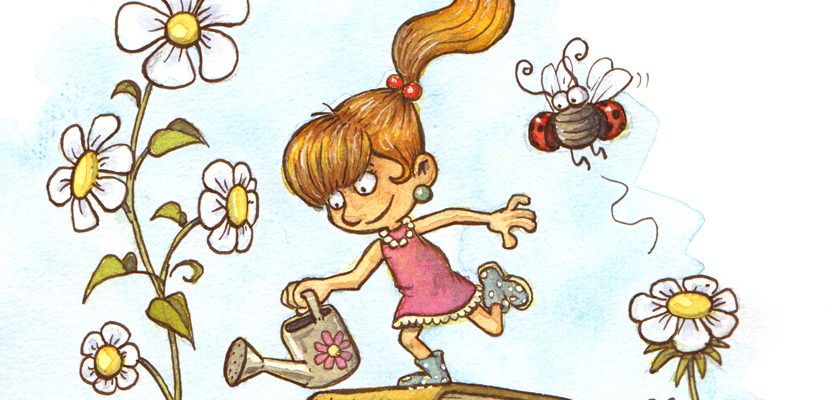
Seeing this drawing (below) by the Argentinian illustrator Gabi Cerda (@crdagabi on Instagram) made me instantly happy. It’s a funny drawing with a nice composition and the more graphical style fits with the rather lighthearted idea of the illustration.
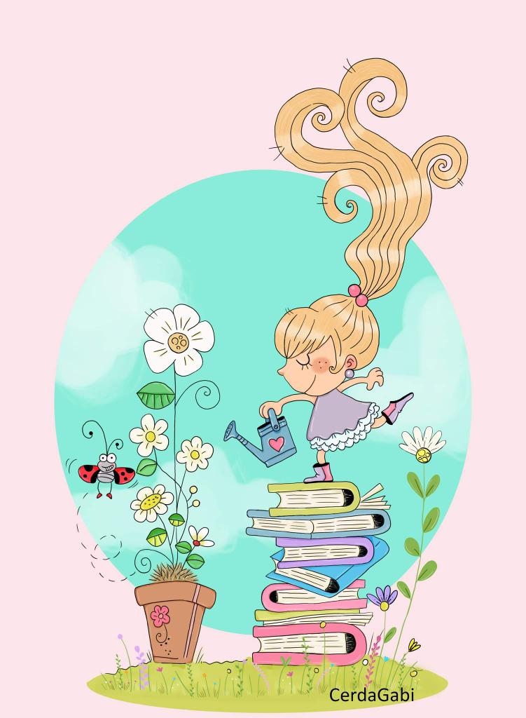
Sometimes I do a #drawthisinyourownstyle on Instagram (a challenge where you make your own version of someone else’s drawing), so after asking (politely 🙂 ) if I could have a go with it, I began sketching.
Below you find the different stages of progress and the final version.
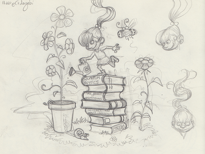
I started with a sketch of course, that I finished quite fast, because I could reuse the existing composition. As our styles differ much, you can see that I added more depth through perspective.
As part of my usual workflow, I scanned the sketch and made a subtle print on Canson paper. This allows me to keep my original sketch in my sketchbok. Then I do the inks on the printed version. The (laserprinter-)ink doesn’t attach very well to the Canson drawing paper. This allows me to erase the subtle printed sketch lines with an ordinary eraser after inking.
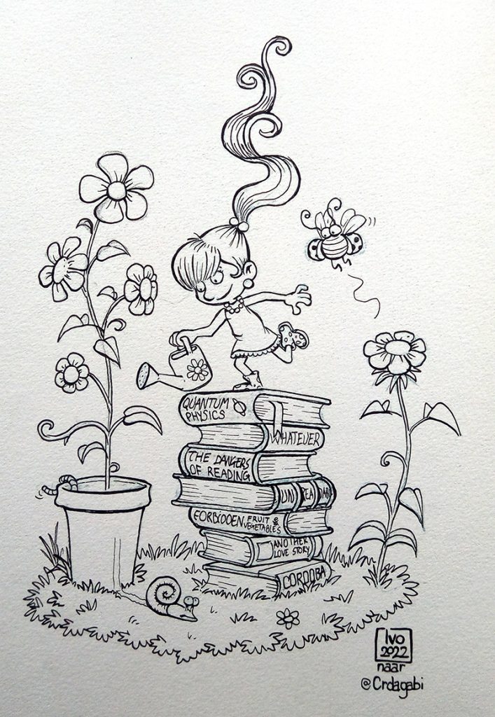
Then the watercolours come in! First I add a warm yellow undertone.
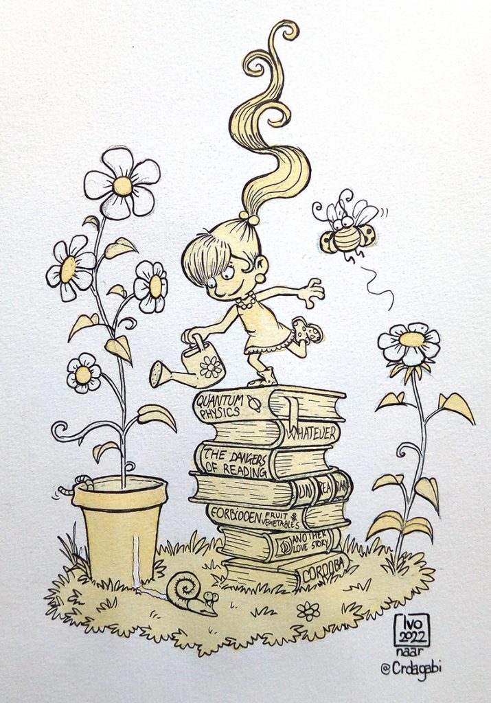
Then I add shadows (usually a mix of ultramarin blue and burnt sienna, which result in a warm grey tone).
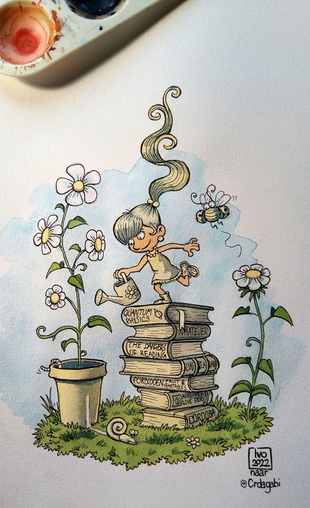
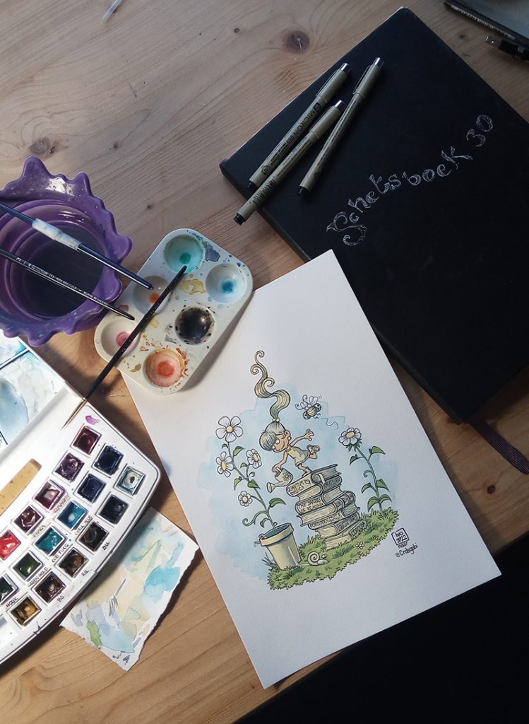
How my workplace looks while painting…
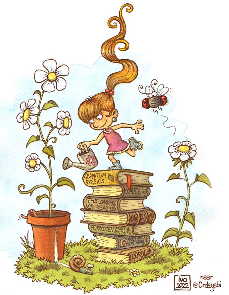
And then, after adding the other colours and some finishing touches (including adding accents with Caran d’Ache colour pencils) the illustration is ready!
You can follow @crdagabi ’s work on https://www.instagram.com/crdagabi/ and on https://www.instagram.com/pecosas.ar.
